Color Psychology: Choosing the Right Palette for Each Room
Colors have a profound impact on our emotions, mood, and overall well-being. When it comes to interior design, choosing the right color palette for each room can significantly enhance the ambiance and create a harmonious environment. In this blog post, we will explore the fascinating world of color psychology and provide guidance on selecting the perfect color schemes for different rooms in your home. Discover how to harness the power of colors to transform your living spaces into inspiring and captivating sanctuaries.
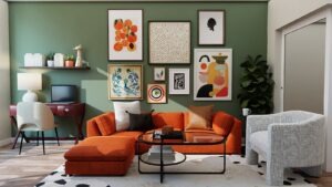
The Power of Warm Colors: Energize and Stimulate
Warm colors, such as red, orange, and yellow, are known for their ability to create a vibrant and energetic atmosphere. They can stimulate conversation and creativity, making them perfect for social spaces like the living room or dining area. Consider incorporating warm hues through accent walls, upholstery, or accessories to infuse your room with energy and excitement.
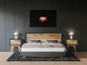
The Calming Effects of Cool Colors: Relax and Unwind
Cool colors, such as blue, green, and purple, have a calming and soothing effect on the mind and body. They are ideal for spaces where relaxation and tranquility are desired, such as bedrooms or reading nooks. Incorporate cool tones through wall colors, bedding, or artwork to create a serene and peaceful atmosphere that promotes restful sleep and rejuvenation.
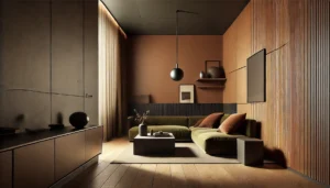
Neutral Elegance: Versatility and Timelessness
Neutral colors, including shades of white, beige, and gray, offer versatility and timelessness in interior design. They serve as excellent foundation colors, allowing you to experiment with various accent colors and textures. Neutrals create a sense of sophistication and provide a blank canvas for showcasing artwork or statement furniture pieces. Use neutrals as the base for any room, and then add pops of color to create visual interest.
The Boldness of Accent Colors: Add Drama and Personality
Accent colors are vibrant hues used sparingly to create visual impact and add personality to a space. They can be applied through statement furniture, decorative accessories, or bold artwork. Select accent colors that complement the overall color scheme and reflect your personal style. These pops of color will draw attention and create focal points within a room, making it visually dynamic and engaging.
Harmonizing Color Combinations: Balance and Cohesion
Creating a harmonious color palette involves finding the right balance between different hues. Consider using color schemes like complementary (opposite colors on the color wheel), analogous (adjacent colors), or monochromatic (shades and tints of a single color) to achieve a cohesive and visually pleasing result. Experiment with different combinations and evaluate how they interact with the room’s lighting and existing decor.
Conclusion
Color psychology plays a vital role in interior design, influencing our emotions, mood, and overall experience within a space. By understanding the power of warm and cool colors, embracing the versatility of neutrals, incorporating accent colors, and harmonizing color combinations, you can create rooms that evoke specific feelings and enhance your overall well-being. Let the language of color guide you as you transform your living spaces into harmonious and inspiring environments.